Friday, August 8, 2008

Star plot

The star plot is used to display data with multiple variables. It is possible to see the distance from zero that each variable goes and determine the variable with the most effect. This star plot is used for oil technologies.


http://www.humble-inc.com/rof_app99-2.htm

Correlation matrix

The correlation matrix shows not only similarities in two data sets, but the degree to which they are similar. It is shown in this matrix using color intensity for higher or lower values.

http://yin.che.wisc.edu/images.htm

Similarity matrix

A similarity matrix allows someone to display corresponding data in a way that is easy to compare and find where the two data sets intersect.

http://tomcat.esat.kuleuven.be/txtgate/tutorial.jsp

Stem and leaf plot

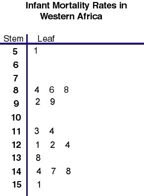
This stem and leaf plot organizes a list of data about infant mortality rates in Western Africa. The data is organized by stem (the first digit), and then by leaf (the corresponding digits). It is then possible to see how many samples share the same first digit, and also what the other digit are.

http://mainland.cctt.org/mathsummer/JosephBond/StemAndPlots/stem-and-leaf_std.htm

Boxplot

This is a simple example of a boxplot. As used in this example, it shows statistics in a graphic manner that represents the median and range. The asterisks represent outlying data.

http://www2.hawaii.edu/~donaldp/Biostatitics/lecture9.htm

Histogram

This histogram shows the frequency of the difference between observed and expected UV indexes at a particular location.

http://www.cpc.ncep.noaa.gov/products/stratosphere/uv_index/uv_validate.shtml

Parallel coordinate graph

This parallel coordinate graph is used to track baseball stats. It is used to graph many variables at once, and shows trends in hits, homeruns, etc.

http://www.matthewtavares.com/baseball_report/